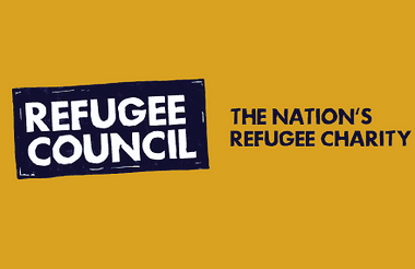
The Refugee Council has revealed new visual branding and verbal messaging, co-designed by refugees.
Developed over two years with communications agency Shape History, to whom the charity paid £96,000, the rebrand includes a new strapline – “the nation’s refugee charity”.
Refugees co-created the new visual branding and influenced how Refugee Council speaks to audiences, especially those who may be harder to reach.
The new visual branding was inspired by the art of linocut printing, in an effort to reflect the “grit and grace” of the charity’s work and the resilience of the refugees it supports.
Reaching target audience
Yusuf Ciftci, head of refugee involvement at Refugee Council, said: “Branding is often perceived as something overly corporate and business-focused, which can feel distant to the refugee communities we serve.
“But having a brand that enables you to reach as much of your target audience as possible, is as vital for a charity as any company.
“As the charity’s head of refugee involvement, but also as a refugee myself, I was so pleased to see refugees playing a big role behind this rebrand: from helping make decisions on messages to testing them and even creating illustrations that are an important part of our new visual identity.
“At a time when there is so much complexity of thought about refugees, and how to welcome and support them, this brand gives an opportunity for us to be crystal clear in our message and vision: we want refugees to rebuild their lives, and be able to have happy futures, contributing to their new communities.”
Co-designed by refugees
The linocut printing style of the charity’s new branding is meant to symbolise the balance between hope and hardship as refugees attempt to rebuild their lives, with each mark carving light out of the dark.
Geli Luna, associate design director at Shape History, said: “The new visual language of Refugee Council is the result of numerous consultations with refugees and creative workshops where they got to co-create elements of the visual identity, bringing lived experience to the forefront of the charity’s work.
“Even the signature ‘grit and grace’ typeface was handcrafted through lino printing, giving the brand a bespoke font that underscores the message of resilience.”
Related articles


