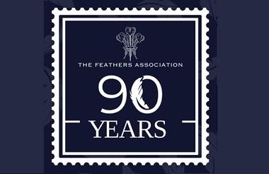
A youth charity has redesigned its logo, which is based on the Prince of Wales’s crest, as it celebrates its 90th anniversary.
The Feathers Association was gifted the crest as its logo when it founded in 1934 at the behest of the prince, who later became King Edward VIII.
Its refreshed logo has been designed to look like a postage stamp, created to symbolise its intent to “make a stamp on society, and in turn leave an indelible mark on history”.
The charity would not say how much it paid for an independent designer to work on the logo but said it was a “minimal cost”.
Originally called the Feathers Clubs Association, the charity initially included a German phrase from the Prince of Wales’s crest, “ich dien”, which translates as “I serve”, but this was removed many years ago.
However, the charity said it would be happy to re-instate the phrase “as it cohesively determines everything that the charity stands for”.
The new logo’s colours have also been subtly changed “to maintain their royal heritage while appealing to contemporary attitude and values”.
It will prominently feature alongside the traditional crest across all printed and digital media throughout the anniversary year, ensuring cohesive brand visibility and recognition.
Feathers Association chief executive David Jones, said: “As the charity celebrates its 90th year, and continues to grow with the introduction of new projects across the country, whilst adapting to the evolving needs of our community, it became clear that our logo should have a refresh to commemorate its ninth decade.
“The design reflects the charity’s overall mission and vision. The design captures the essence of the charity today.”
Initially formed by Freda Dudley Ward, a friend of the former Prince of Wales, to aid those suffering during the Great Depression of the 1930s, the charity moved into youth and community work after the Second World War.
The charity recorded an income of £650,000 and expenditure of £917,000 in the year to March 2023 and employed 25 staff.
Related Articles


